SHUMO STUDIO
WEBSITE ANALYSIS
Website Analysis
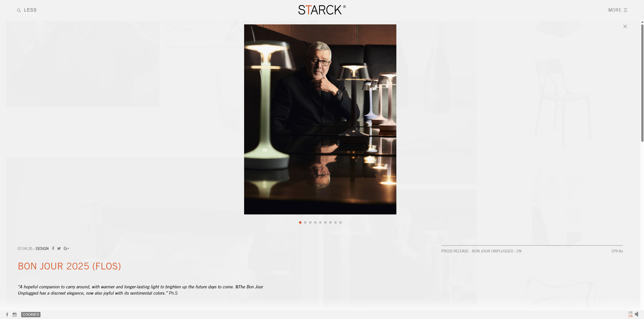
Starck.com is the website of a French industrial architect and designer Philippe Starck.
Primary Target Audience
- Potential employers/clients to have a quick overview of Philippe Starck's past projects and visual style.
- Other designers or students visit to learn about his work, or appreciation purposes, and or make connections.
- Press and media seeking knowledge about him and making contact for interviews or other events.
Content Strategy
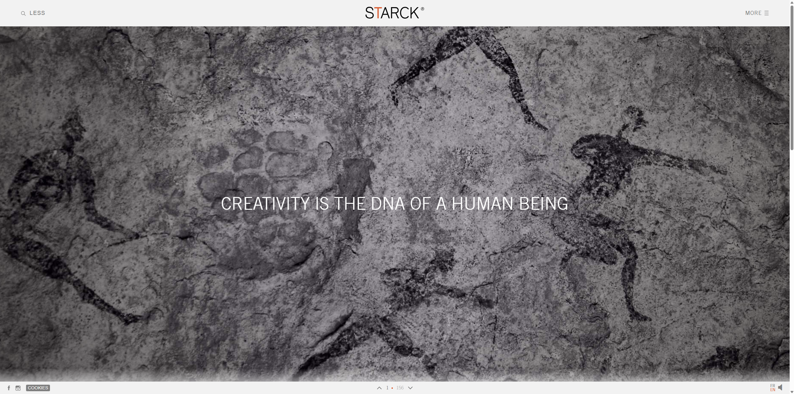
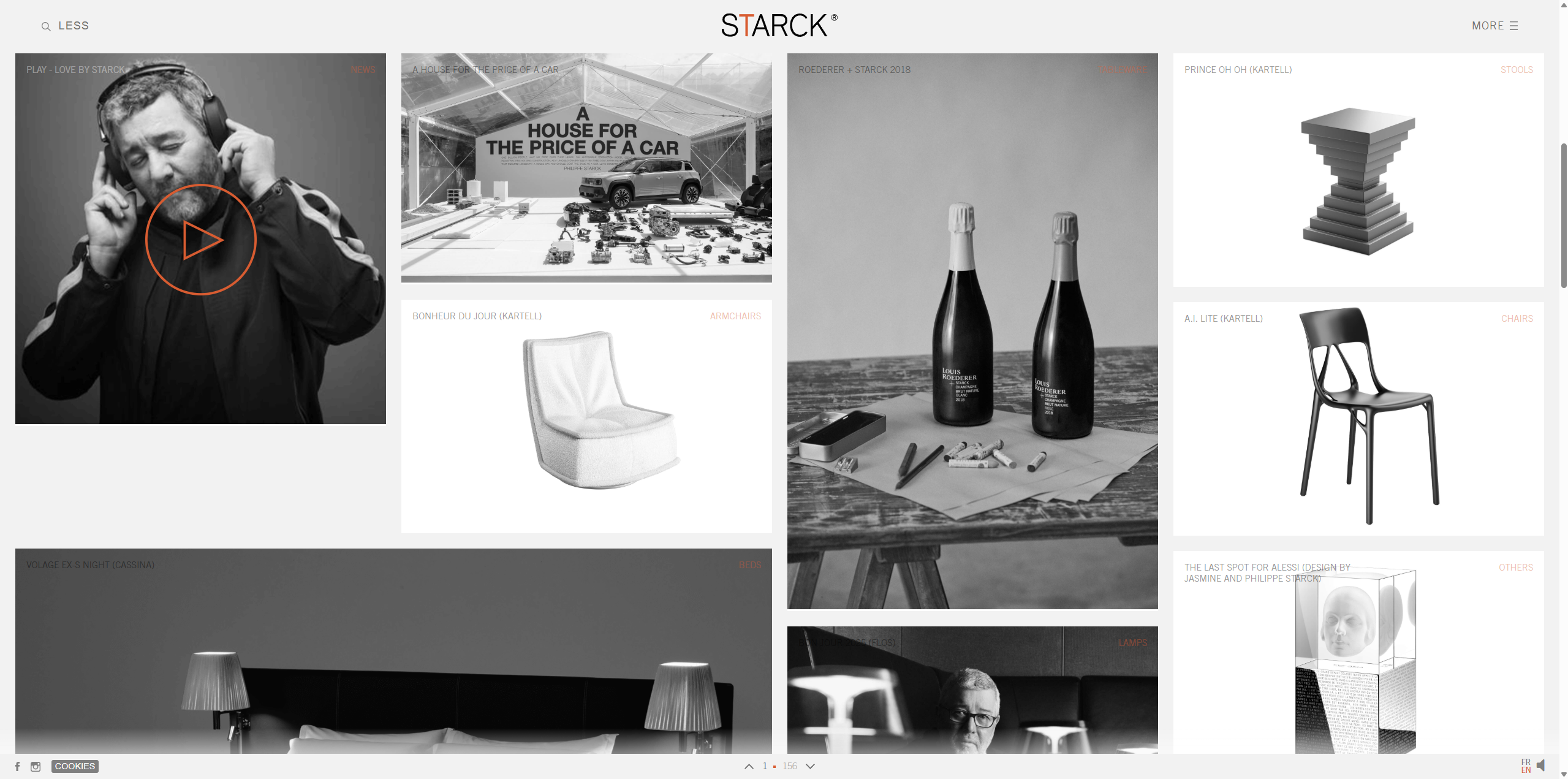
Website homepage have eye catching phrases that change every time you refresh the page like "tomorrow will be less" "The best part of our genius is our intelligence" etc. After that it go straight to his work page, with his projects laying out for the user to choose to look closer.
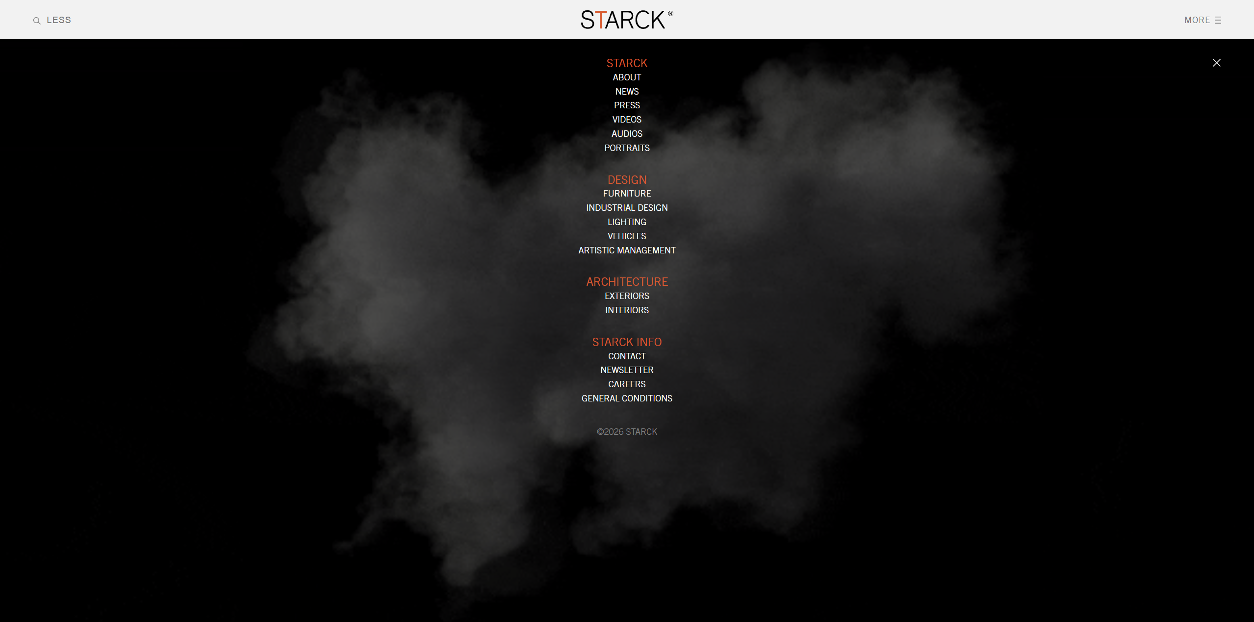
Navigation
On the top is the navigation bar, when “more” is clicked the navigation centre will fill the page with different categories and details for user to choose from. It is fairly easy to find and the top nav centre is well categorized for different audiences and different types of projects he has designed.
Visual Design
- The website has a clear visual style that carries though out the entire website.
- The use of orange is a very nice touch to the site, that is also part of the visual style and helps the uniformity of the site.
- The website has a clear use of vertical grid system.
- The images of projects always follow such grid that makes the visual clear and clean.